I love working with Divi, and using Divi to create your portfolio website is fantastic. Divi offers two native modules, the Portfolio Module and the Filterable Portfolio Module, that help you showcase your work beautifully.
The Filterable Portfolio Module is handy because it allows you to filter your work by category, displaying it in a more organized way. However, it does have its limitations. One issue I faced recently was with the number of columns. You can showcase your portfolio in full width or a grid, but the grid only displays in 4 columns by default.
I wanted to change the 4 columns to 2, so I looked for a tutorial and found a great one on the Elegant Themes blog. You can check out the full tutorial or follow the step-by-step guide here.
Customizing the Filterable Portfolio Module with CSS
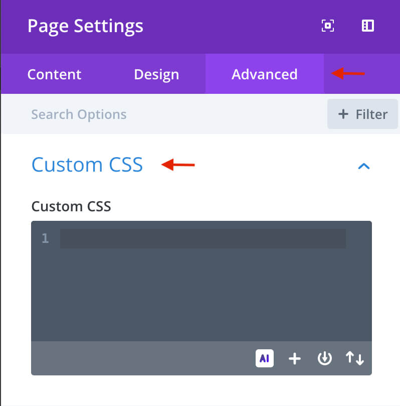
We start with a minor adjustment by removing the default transition module. To do this, go to Page Settings and access the Custom CSS tab.
You can find Page Settings under the page in the purple circle with the gear icon.
Page Settings advanced Custom CSS:
Add the following CSS to Custom CSS:
/* Remove transition */
.et_pb_filterable_portfolio .et_pb_portfolio_item.active {
transition: none;
}
.et_pb_portfolio_item {
animation: none!important;
transition: none !important;
}
Changing the Filterable Portfolio Module to Two Columns
In the Page Settings you will add the following CSS:
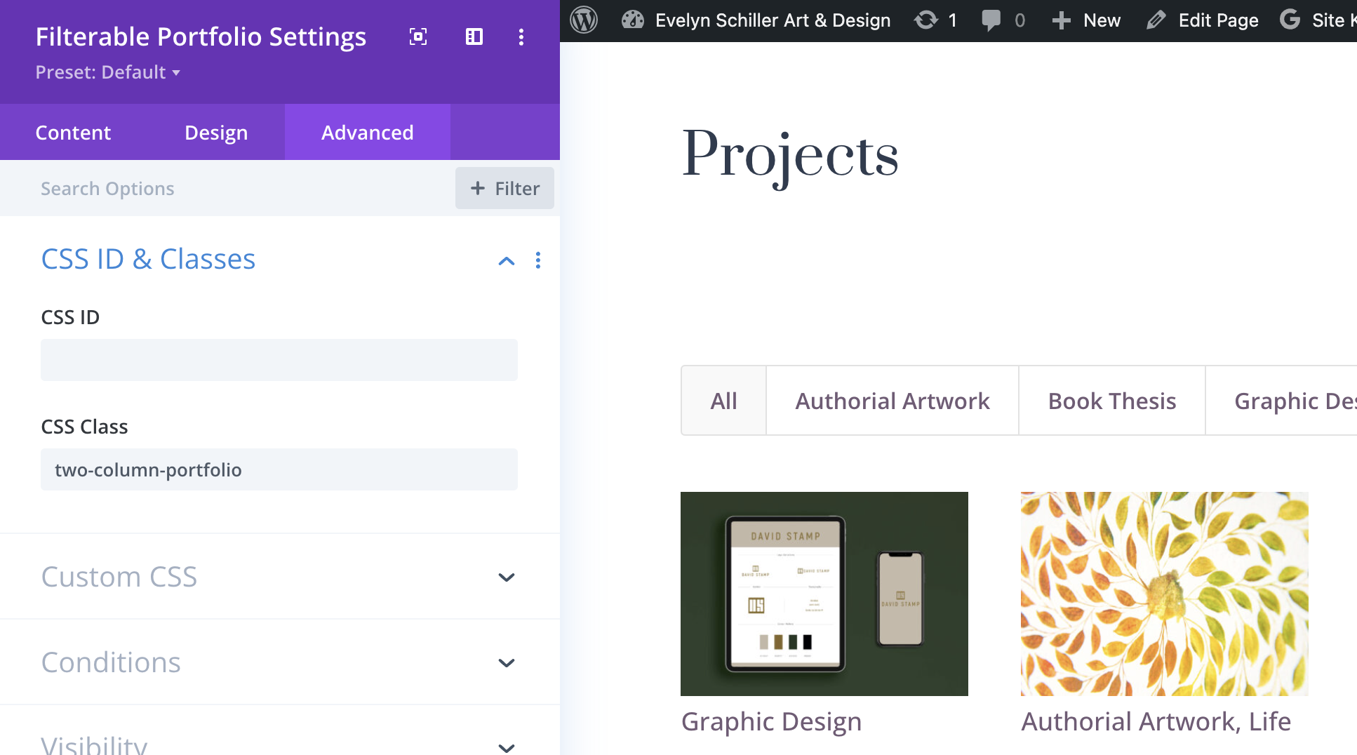
/* 2 Column Portfolio */@media (min-width: 981px) {.two-column-portfolio .et_pb_grid_item {width: 47.25%!important;margin-right: 5.5%!important;}.two-column-portfolio .et_pb_grid_item:nth-child(3n) {margin-right: 5.5%!important;}.two-column-portfolio .et_pb_grid_item:nth-child(2n) {margin-right: 0!important;}.two-column-portfolio .et_pb_grid_item.et_pb_portfolio_item:nth-child(4n+1) {clear: none!important;}.two-column-portfolio .et_pb_grid_item.first_in_row {clear: unset;}}Then, in the Filterable Portfolio module settings, you will click on the Advanced tab and add the CSS class:
Filterable Portfolio settings > Advanced > CSS ID & Classes
Changing the Filterable Portfolio Module to Three Columns
In the Page Settings you will add the following CSS:
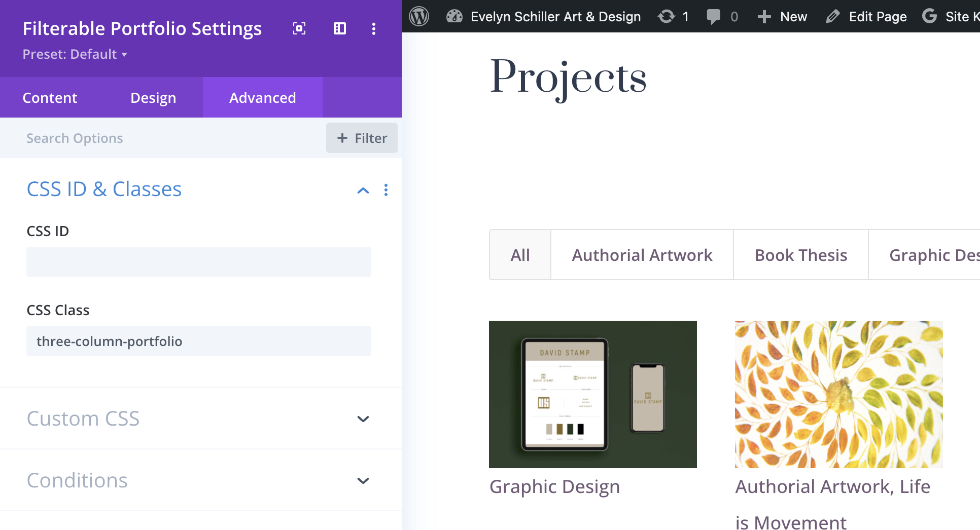
/* 3 Column Portfolio */@media (min-width: 981px) { .three-column-portfolio .et_pb_grid_item { width: 29.66%!important; margin-right: 5.5%!important; } .three-column-portfolio .et_pb_grid_item:nth-child(3n) { margin-right: 0!important; } .three-column-portfolio.et_pb_grid_item:nth-child(4n) { margin-right: 5.5%!important; } .three-column-portfolio .et_pb_grid_item.et_pb_portfolio_item:nth-child(4n+1) { clear: none!important; } .three-column-portfolio .et_pb_grid_item.first_in_row { clear: unset; }}Then, in the Filterable Portfolio module settings, you will click on the Advanced tab and add the CSS class:
Filterable Portfolio settings > Advanced > CSS ID & Classes
Correcting the Blurry Images
After completing all the steps, you might notice some blurry images in the thumbnails. To resolve this issue, you will need to install a child theme.
Here is a ready-made Divi child theme that you can install from within your WordPress Dashboard by navigating to Appearance > Themes > Add New.
Dashboard > Appearance > Themes > Add New
If you are new to creating a child theme, check this article.
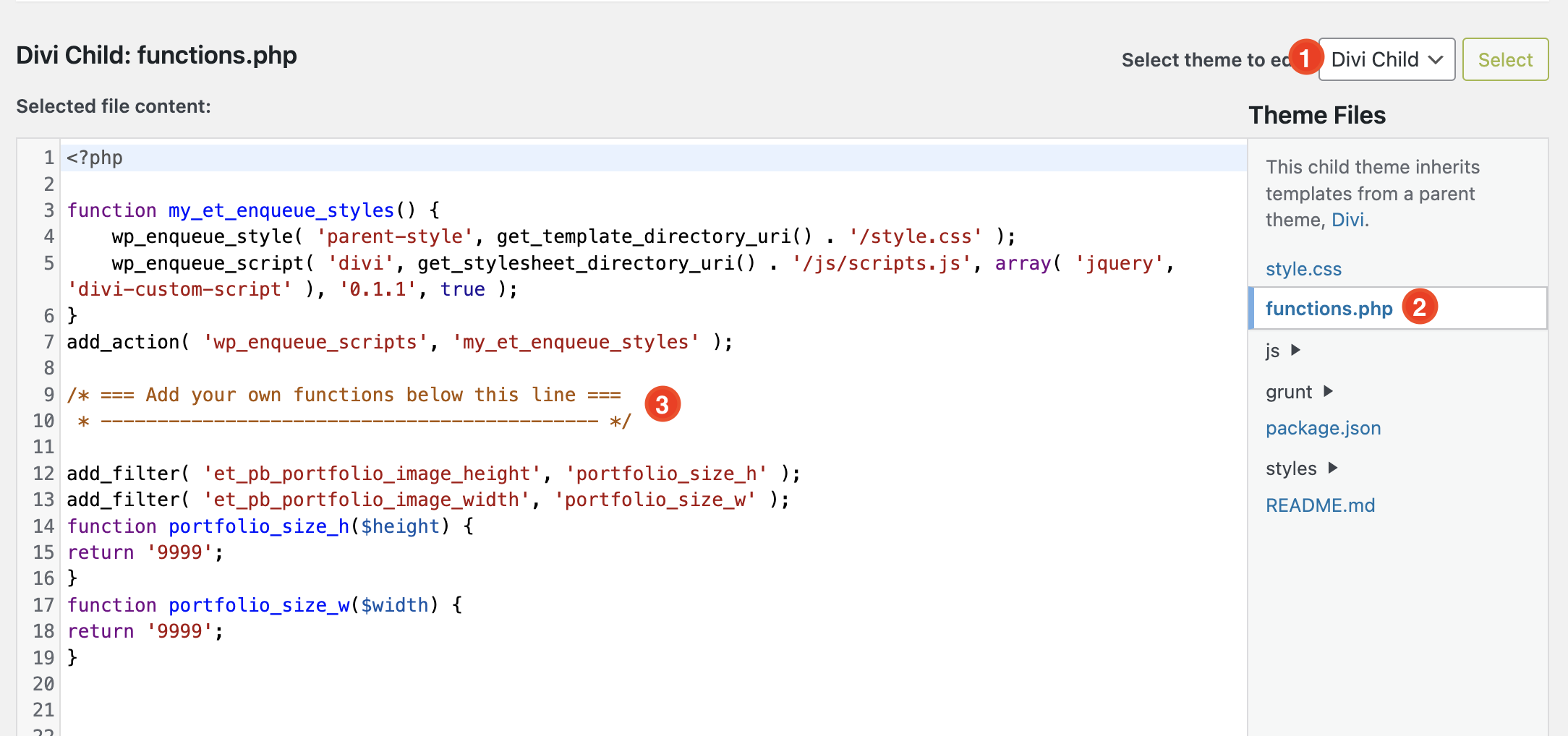
Next, add the following code to the functions.php file in the child theme:
add_filter( 'et_pb_portfolio_image_height', 'portfolio_size_h' );
add_filter( 'et_pb_portfolio_image_width', 'portfolio_size_w' );
function portfolio_size_h($height) {
return '9999';
}
function portfolio_size_w($width) {
return '9999';
}


